Here are the results from the process of creating my portfolio, from user research to user testing, and how I discovered and incorporated my findings.
Click on any of the subsection headers to see the original documents.
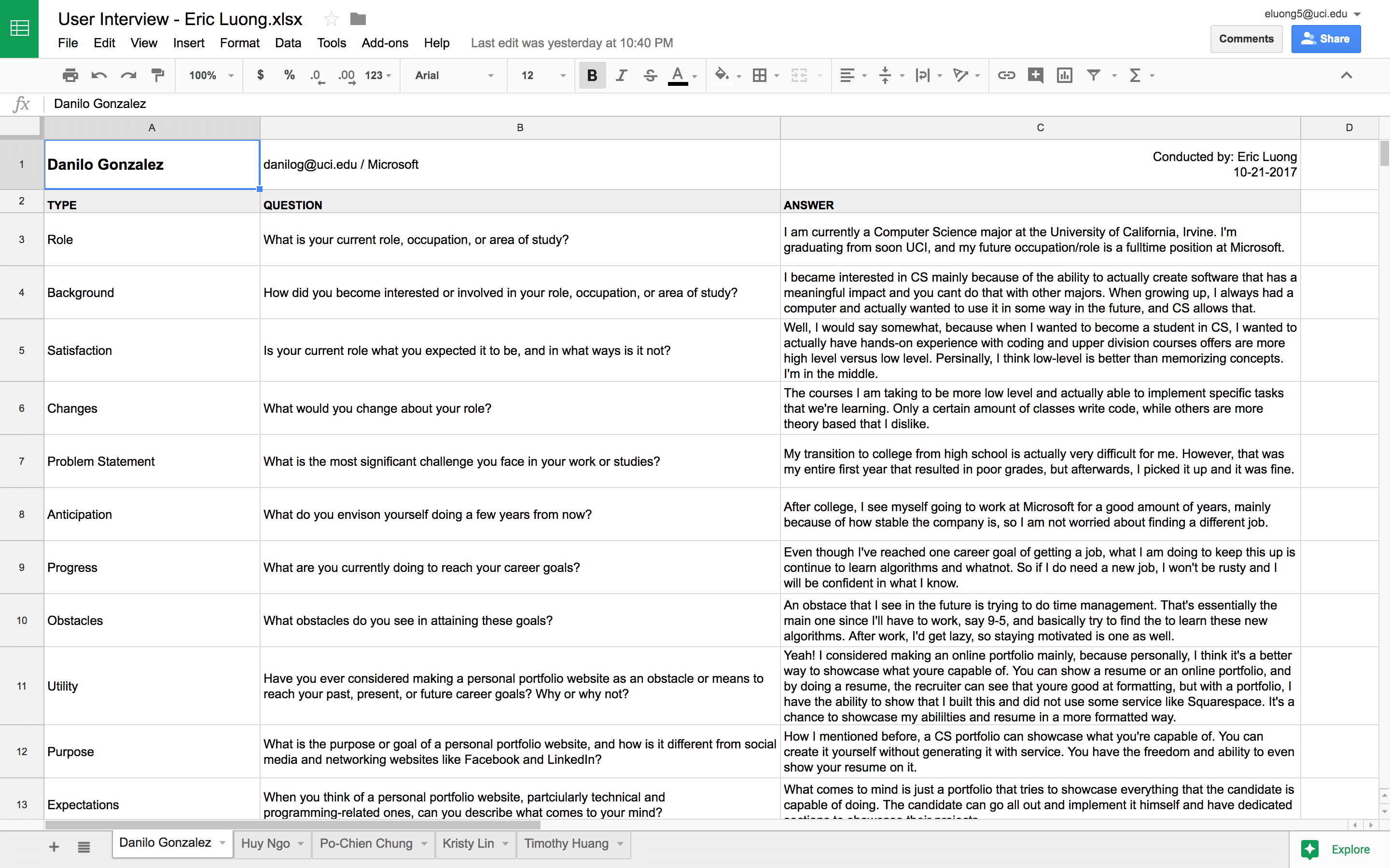
I began by interviewing several potential and relevant users, such as students and individuals working within the industry. This is a critical step to understand and discover what users want to see in a portfolio and helps to identify objectives and goals. Aside from asking about the interviewee's background, questions focus on the purpose of a portfolio, dos and don'ts, concerns, design, features, and content to include to make a portfolio successful.
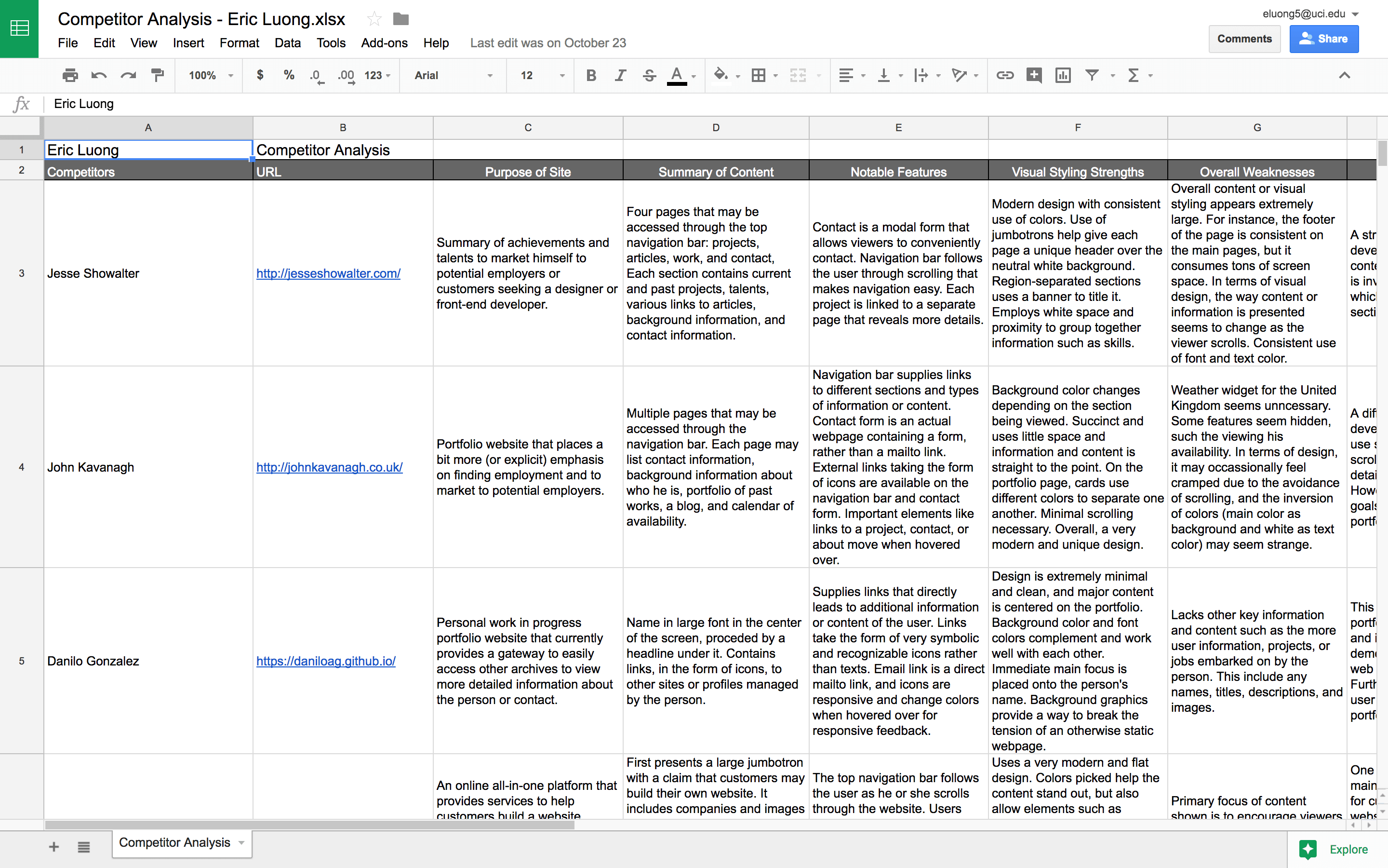
A competitor analysis is a process in which a person reviews his or her direct or indirect competitors to learn about what they are doing, how, and what works. The process allows the person to discover both their competitor's strengths and weaknesses. I accordingly reviewed three portfolios of direct competitors, developers and students, and two indirect competitors, Square Space and LinkedIn. By reviewing competitors in my field, I can understand how to place myself in a better position relative to my competitors to market my skills to employers.
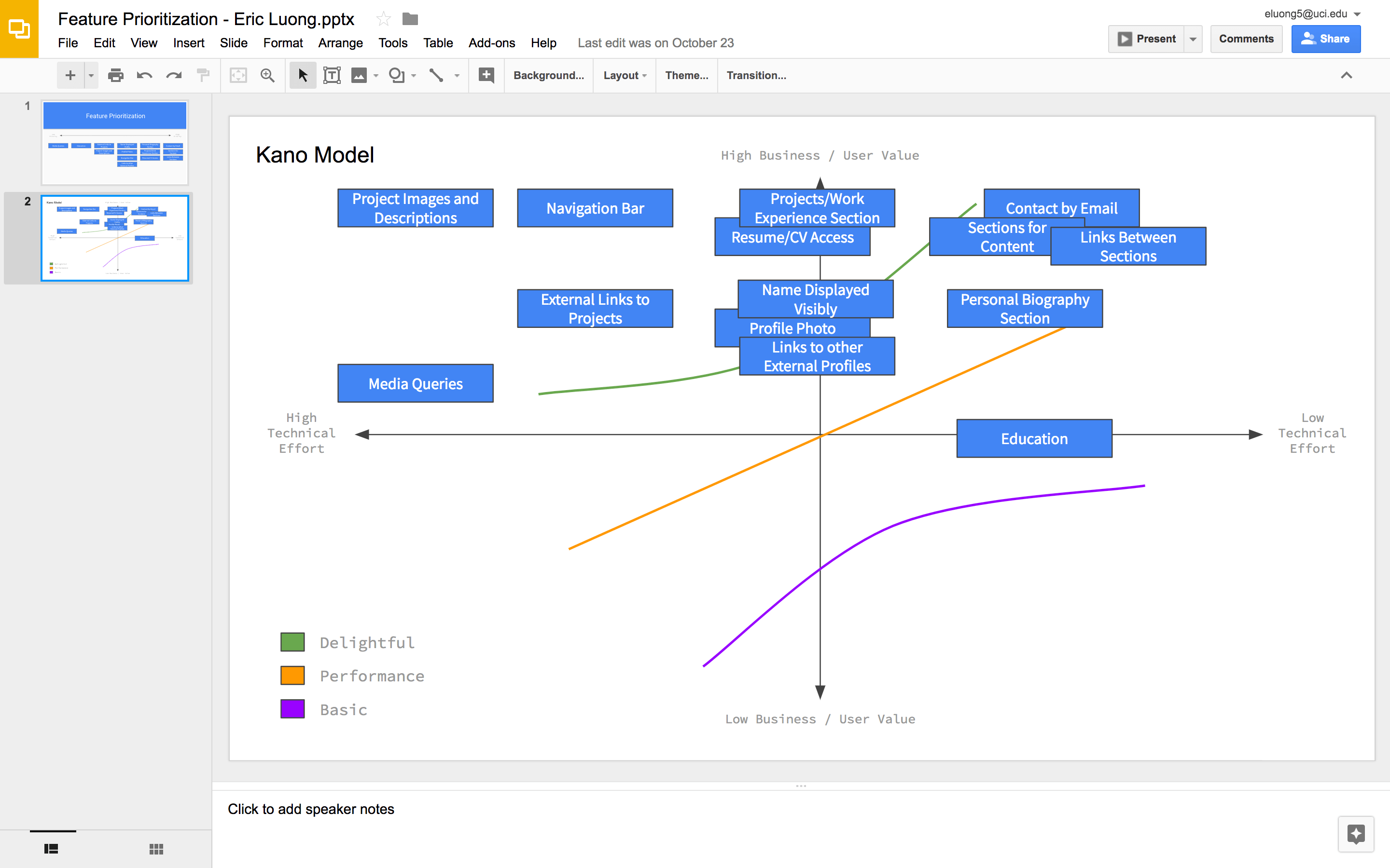
A feature value matrix is a chart that allows designers to associate a potential feature or function against its total score based on estimated user and business value and development effort. There are several reasons for why I selected such features. Several features such as showing my name, photo, biography, and contact email are inherently mandatory for a portfolio. Based on my user research and competitor analysis, I discovered several other features that may add value to my portfolio.
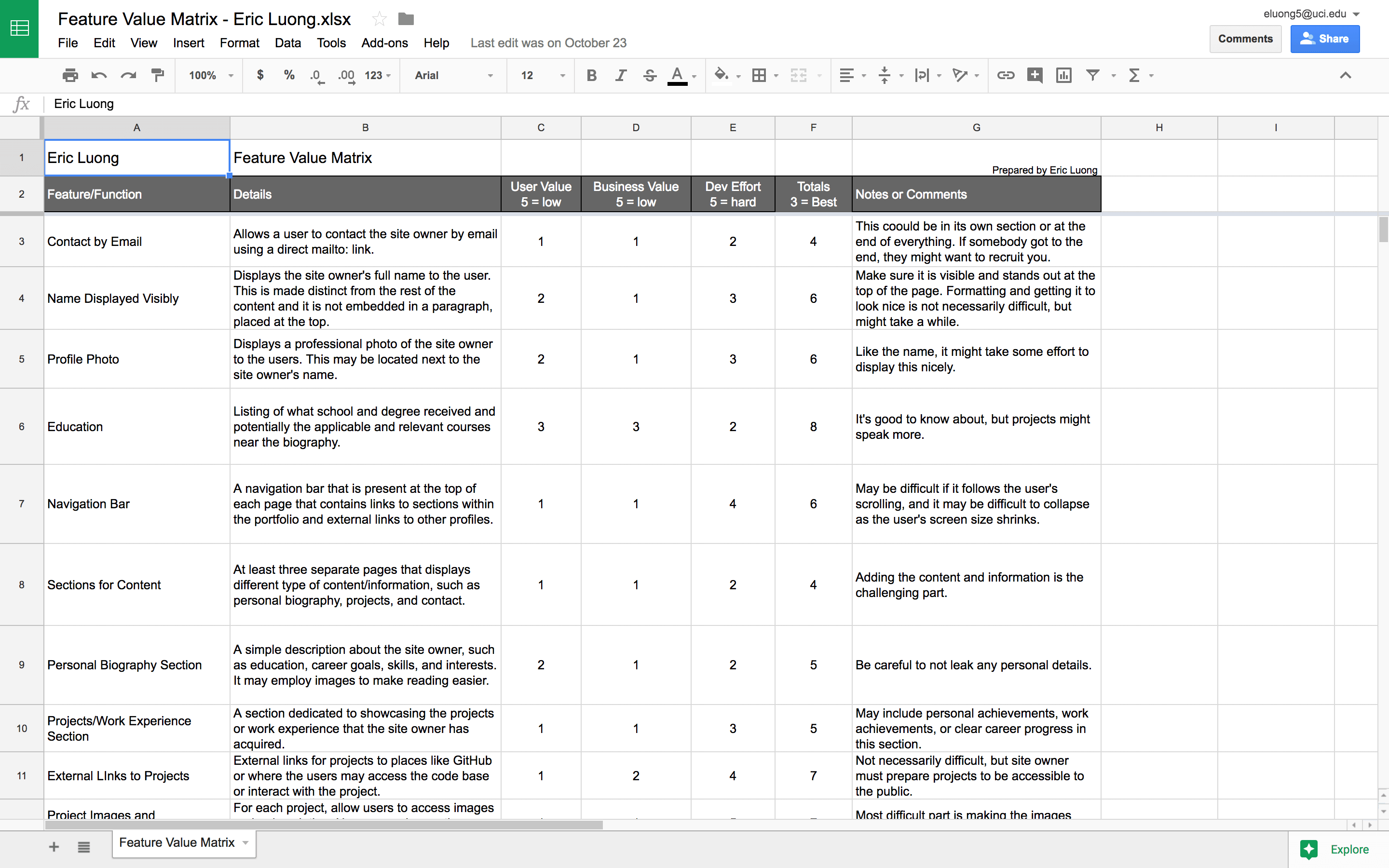
Feature prioritization can easily be incorporated into building an interface such as my portfolio. Using the feature value matrix, I prioritized features that yielded high user and business value and required the least development effort. Such features have a lower total score in the matrix. The prioritization is represented visually in a product roadmap or Kano model. By prioritizing features, the roadmap pushes out high-valued interface features or functions without much development effort first, saving the lower-valued or harder ones for later.
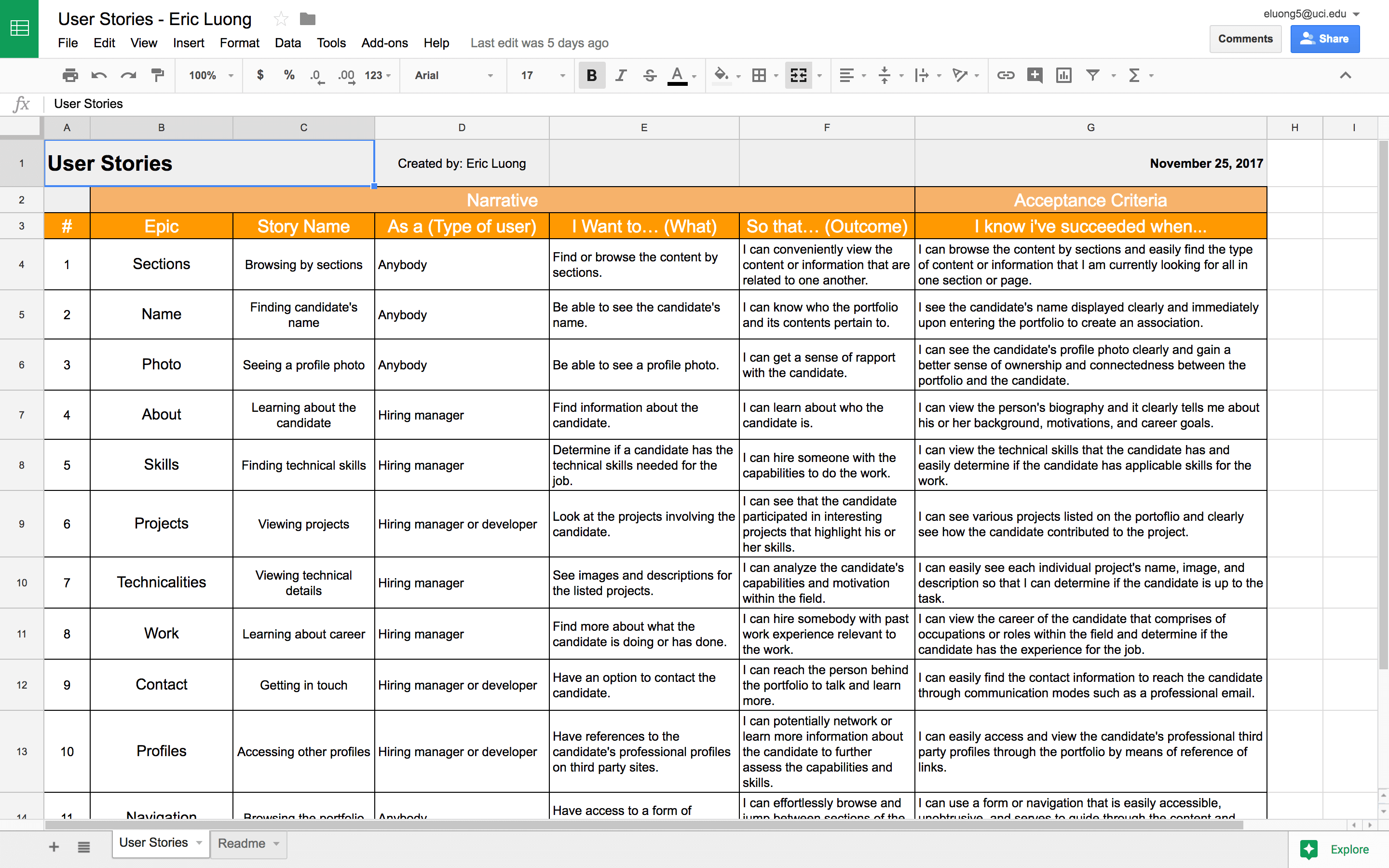
User stories are also an important step. They allow developers to understand why a specific feature might be useful or important to a particular user. It makes them think about what a user might want to do and hope to accomplish by using some feature. In order to understand how the features I chose would be needed by users, I had to think in their shoes. In third person as if I were a user, I constantly asked myself, "What do I want to do here, what I hope to achieve, and how do I know I succeeded?" Repeating this for every feature in my feature list, I created stories to better understand how a feature is useful to both general users and users within the industry.
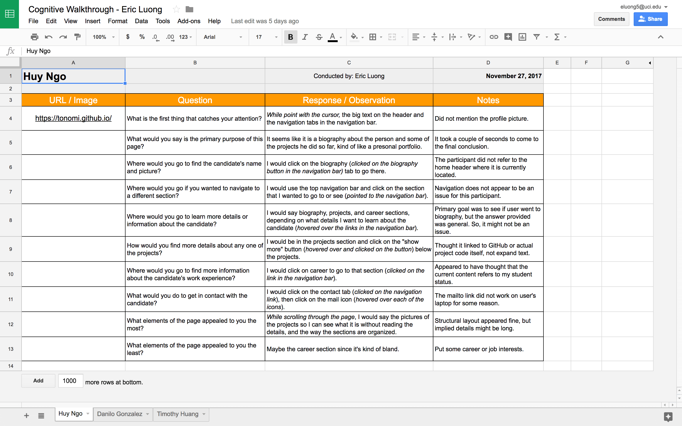
A cognitive walkthrough is a qualitative usability testing method that asks potential users questions or to perform tasks step by step and assess whether he or she can accomplish them. Because it excels at pinpointing any usability issues and creating possible solutions, it's important to perform these tests. Even then, it's possible to run into issues while performing them. For example, I found that participants had a hard time explaining pain points and potential issues. I can't peer into the head of the participant, so as the interviewer, I must come up with questions on the fly to help guide the user or extrapolate from their responses to gain insight into their thought process. This can be difficult to do, especially for questions that may appear trivial.
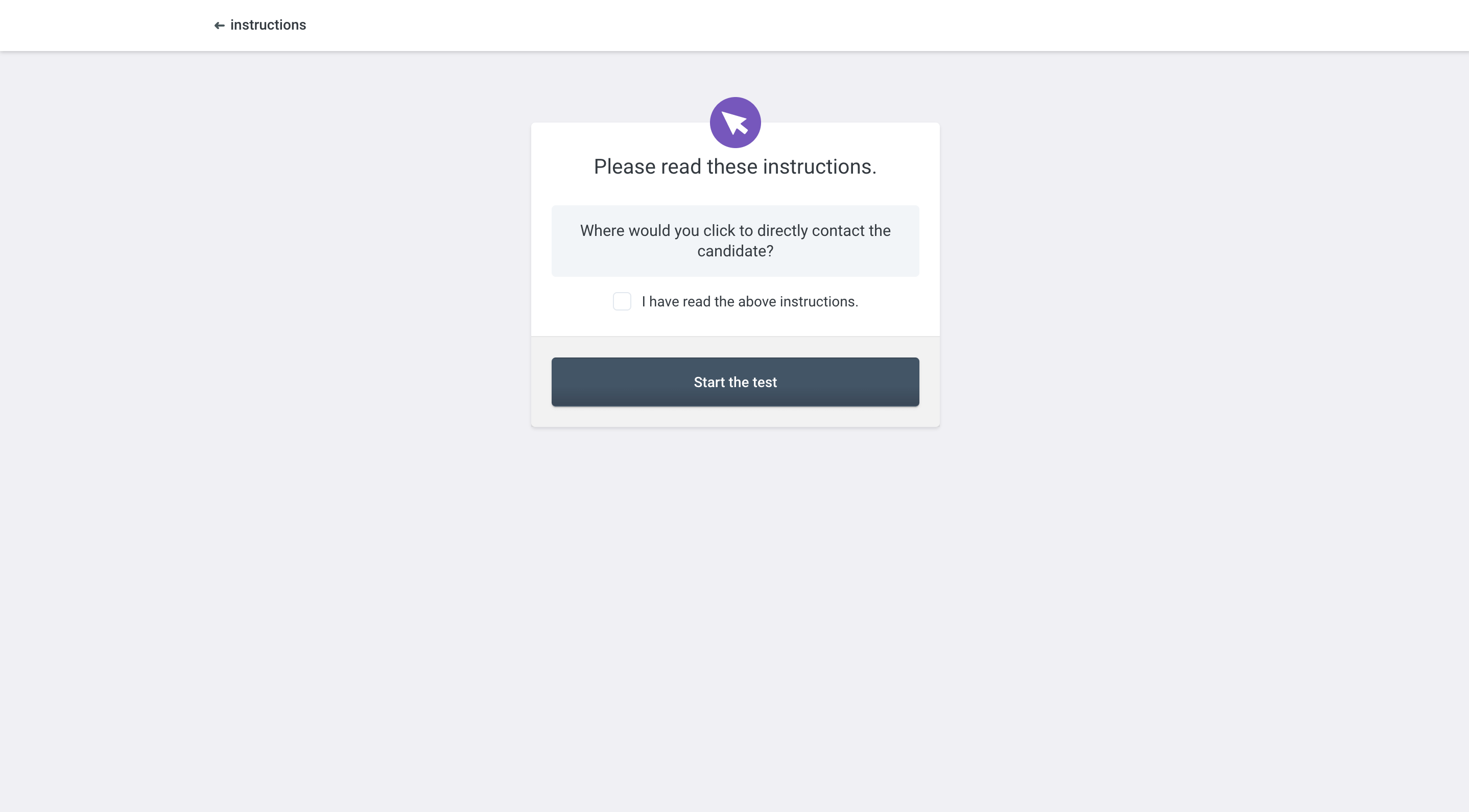
Using Usability Hub, I performed two types of tests. Based on my cognitive walkthroughs, navigation tests and preference tests might not have given me the best value, and I don't want to play a memory game with the five second test. This leaves me with the question test and click test. It's important for users to know the purpose of your site immediately, so I asked questions about the landing page to ensure that the users can tell that it is a personal portfolio belonging to somebody, and they can figure where to go to navigate. It's also important to know how to directly contact the candidate, so the click test ensures that. Despite participants often not reading instructions or doubting themselves, these test results did identify one issue that I describe below.
My user research helped me understand what a portfolio should strive to be. Professional, organized, and personal with useful features and content that make me stand out of the crowd. Many of these findings turned into actual features that I described in a previous section. Additional findings came from user testing. Let's start with online user tests, particularly the question test about the landing page that I described above. Though most testers understood the purpose of my website quickly, one of my testers pointed something out. Just by looking at the landing page alone, the user may see my name, photo, and navigation bar, but there is nothing to signify that it's my technical portfolio. So, it would be difficult for a new user to understand the purpose of my website right away, until the user scrolls down to see the content. The point raised a valid concern, and with a larger sample size, another tester might not able to figure out what type of website he or she is looking at.
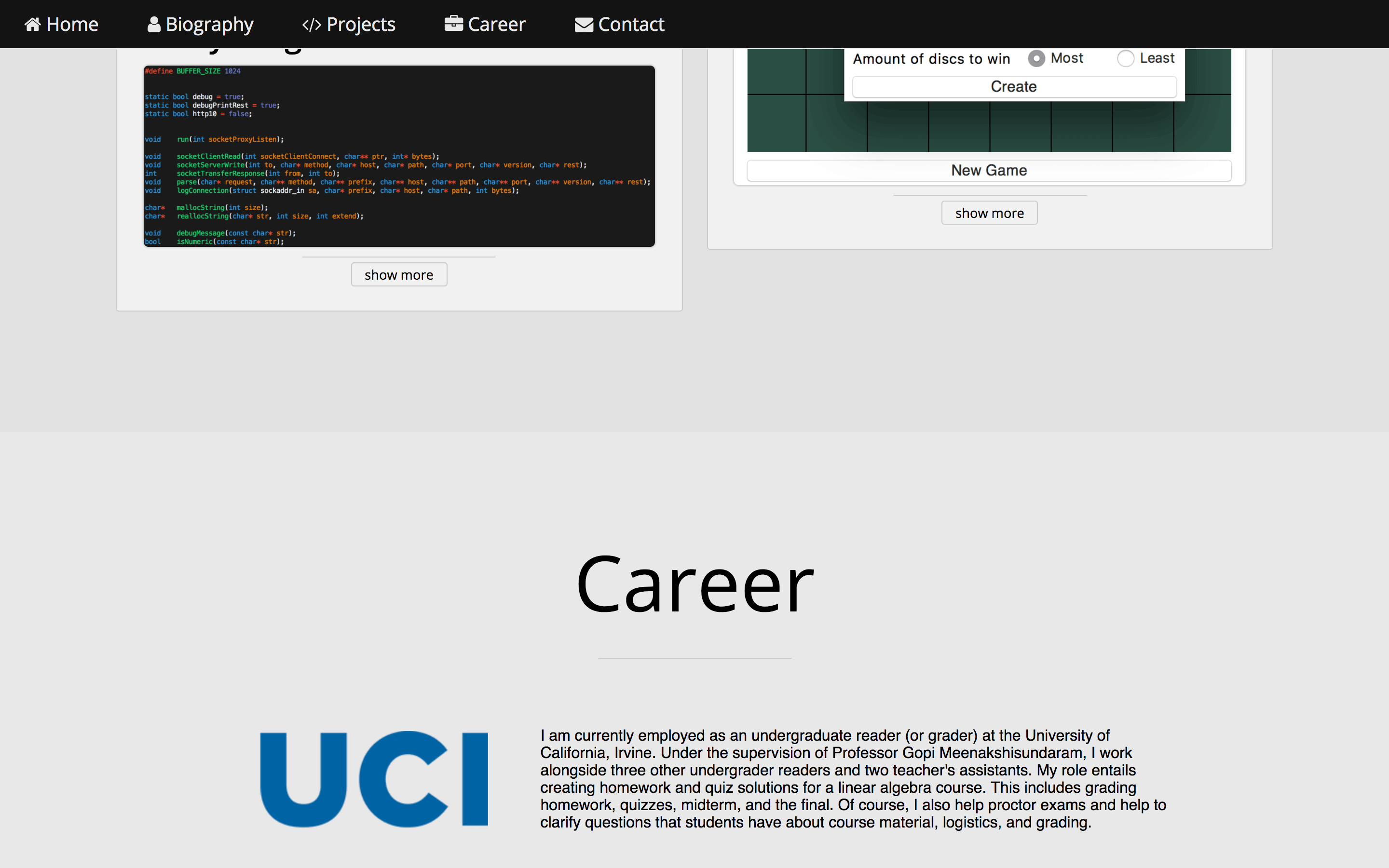
From my cognitive walkthroughs, some participants helped to verify the issue above. They also raised a couple other issues. One participant, when looking at a paragraph describing my current occupation, assumed it referred my studies at the University of California, Irvine. He jumped to the conclusion due to UCI's logo on the side, but the point was clear. Nobody wants to read long paragraphs. Additionally, the overall experience section and portfolio as a whole appeared bland or empty to some participants.
Continuing with the cognitive walkthroughs, some participants also ran into trouble utilizing the expandable and collapsable project details when they browsed the projects section. One participant thought it linked to a GitHub page or an interactive website. Other participants implied that the feature is simply redundant and unnecessary. A final issue to point out is that my name and image is not guaranteed to be present in the biography section where a participant thought he may find that.
I took user feedback wholeheartedly and tried to incorporate all of my findings. Using the link on the navigation bar, go back to the main page to see these findings incorporated.
Let's begin with the landing page problem and the problem with finding my name and photo. First, I deleted the home navigation link that realistically only served to scroll to the top of the page. I relegated this task to the about navigation link, so the about section now includes my name and photo where users expect to find it. Additionally, I included area of interests that is visible or very near on the landing screen. These changes makes it easier to find my name and photo and makes it easier to determine the type of website right away.
Big paragraphs are now significantly reduced or gone. In my work and projects sections, I reduced long-winded paragraphs into a few sentences so that it's more inviting and less of an eyesore to read. It's now hopefully quicker and more likely to get the main points through to the users. With these changes incorporated, the expandable project detail feature became even more redundant since it was originally intended to hide information until users wanted to view it. The reduction of paragraph lengths allows me to remove this feature entirely and any confusion it brought, creating a cleaner appearance.
A huge obstacle is time. There are still findings and improvements that I have yet to incorporate, which mainly relates to design and content to make my portfolio less bland and boring and more personal to make myself stand out. For the currently listed projects, I plan to create an individual page for each one, where I can safely go into detail and technicalities of the respective project. I also plan to improve the design of my portfolio to better reflect my personality and create a friendlier atmosphere. However, the process of coming up with an idea, drawing it out, and coding it up can be a heavy process, and some of these findings are not a do-and-done type of deal. So, these findings will be incorporated piece by piece over the future.